
The GEI and a presentation puzzle
Yesterday was International Women’s Day, so the airwaves were humming with news, reminders of where there has been some/no progress, encouragements and disappointments. In the spirit of international exchanges I thought I’d just focus on one source of comparative information which relates to my recurrent theme of the under-recognition of women’s competences.
The EU’s Gender Equality Index was flagged up by Laeticia Thissen in her excellent Social Europe piece. It covers the domains you’d expect: work, money, power, health, time and knowledge, and is a trove of . The indices inevitably give only a broad and partial picture but the data provides a great platform for identifying where more needs to be done and especially for informing positive discussion. Except, of course, that it now doesn’t do that for the UK. Just one of those Brexit casualties, as we drop out of these comparative exercises. Big sigh… (We badly need a running account of these kinds of Brexit effects; I’m actually hopeful that a website will shortly appear which will do just that.)
Moving on, as they say: useful though the GEI is, I’m puzzled by one aspect, highly relevant to the Paula Principle. Each of the 6 domains is given an overall score, with the gap between women and men indicated by a score out of 100. The higher the score, the nearer the country is to equality in the domain. This makes perfect sense in relation to, for example Money: mean monthly earnings are used to show the GPG, with the EU as a whole scoring 82.4. Austria, where I have just acquired citizenship, scores relatively well at 87.7 France, my semi-adopted country, is at 84.4.
So far so good. But I’m puzzled by the way the data in the Knowledge domain is presented, as if 100 is the max. Two indicators are used – the proportions of women and men graduating from tertiary education, and the proportions participating in formal or non-formal education. These are then used to construct the overall % figure. The EU’s 82.4 score is derived from the following charts; I show the data by age group because this gives a sense of how things have changed over time as women overtake men. First, the tertiary graduation rates:
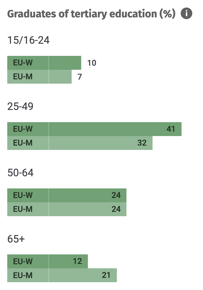
The change over time is evident, as women came from behind in the generation now aged 65+ to overtake men and are now graduating across the EU at roughly 25% higher rates than men. My two chosen countries show interesting variations in the trends of their graduation rates: the W/M rate in France moves from 15/21 for those over 65 to 28/26 for the 50-64 and 49/41 for 25-49 year olds. In Austria the crossover happened later, reflecting the country’s greater social conservatism: the respective figures are 11/26; 23/31; and 40/36. The figures for the population as a whole are 31/29 (France) and 26/30 (Austria).
So that’s one indicator. The second is adult participation in formal/non-formal learning. Here the pattern is similar, though less pronounced. In this case older women are actually ahead of their male counterparts, though the participation rates for this age group are very low. It shows that women go on learning more than men do thought their lives.

The overall W/M figures for participation are 28/23 (France) and 20/17 (Austria).
So far so good. However I am truly puzzled about the actual index figure used. You don’t need me to remind you – especially if you’ve been reading any of the Paula Principle blogs – that unlike all the other domains, in knowledge/education/competences women are ahead of men educationally. So why is the Knowledge score presented in the same way as all the other indicators, as a deficit, ie below 100? Admittedly the colour used for the Knowledge indicator is green, so I could just about imagine that this signals that the numerical equality line has been passed and we’re into new territory. But this semiotic interpretation doesn’t really hold up, as the colours for the other domains are not red or even amber but run from brown to blue to mauve.
Of course anyone who delves into the figures will see them. But I have seen this in other places, where the presentation of data is apparently unable to cope with the fact that women have overtaken men. The point for me is that this actually disguises a crucial, form of dynamic inequality – namely, that even where women have taken the lead in learning it does not produce the outcomes in earnings and careers that you would expect under the kinds of rational model we are taught to respect.
We arrive at a rather paradoxical conclusion; progress in one domain may signal a greater inequality elsewhere. In other words, as women increasingly outperform men in ‘knowledge’, to use the GEI label, so the failure to close the pay and careers gap becomes even more glaring.
It’s of course possible that I’ve misread or overlooked something, and I’d be grateful to anyone who can point that out. But otherwise please let’s not be misled by the tyranny of a zero difference as the only goal.